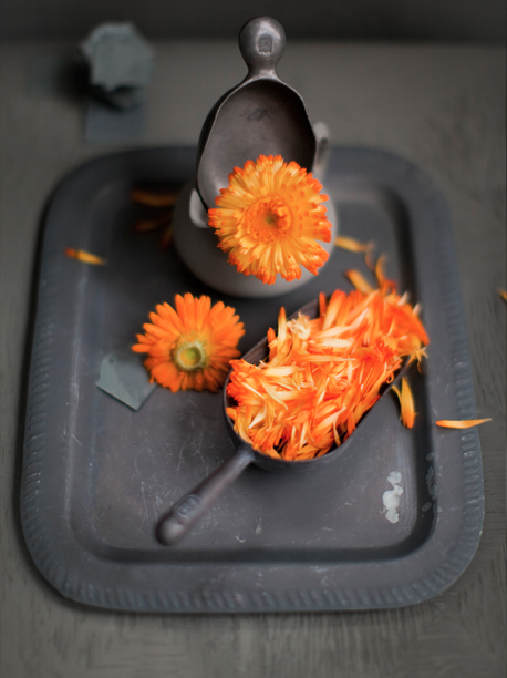

It is not a secret that Dietlind Wolf is one of my favorite stylists. Without any pretentiousness and with her own view and style, she always combines in a perfect way details, composition and emotions. In this photo shoot, published in the autumn issue of Sweet Paul Magazine, Dietlind plays with the warm orange colors of the calendula. She achieved great contrast between the flower leaves and the background of the upcoming winter days.


Не е тайна, че Диетлинд Уолф е една от най-любимите ми стилистки. Без излишна претенциозност и с изграден свой стил, тя винаги успява да съчетае по чудесен начин детайли, композиция и емоция. В тази фотосесия, която е правена за есенното издание на Sweet Paul, Диетлинд се заиграва с топлите цветове на невена, контрастиращи на фона на приближаващите зимни дни.

// images and styling: dietlind wolf
Leave a Reply